Many users like to customize their instant messaging applications, and one small but useful change is changing the launcher icon. The icon will appear on your phone’s home screen, so changing it can help the app blend better with other apps or better suit your personal style, and some users also choose to change JT WhatsApp icon when they want a more consistent or personalized visual layout across their device.
We have shared the ways to hide the voice recording status while typing in JT WhatsApp. In this guide, we’ll show you how to easily change the launcher icon for JT WhatsApp, what options you can choose, and some practical tips for keeping the interface clean and consistent.
Why change the launcher icon
Changing the launcher icon may seem like a small adjustment, but it can significantly improve the daily user experience of your phone. This is not only about appearance, but also about how well the application integrates with the overall phone interface. A well-designed setup that uses the best icon for JT WhatsApp minimal style can make the home screen feel cleaner and more cohesive, helping the app blend naturally with your personal layout while still remaining easy to recognize at a glance.
A common reason is visual consistency. Many users prefer a clean home screen where all icons use the same style or color scheme. If an application becomes too prominent, it will disrupt this balance. Adjusting the icons helps to make the overall look more unified and harmonious.
Another reason is personal preference. The default icon may appear too bright or too conspicuous, standing out slightly compared to other applications. Switching to a simpler or more neutral design reduces the app’s visual impact and makes it easier to integrate with other interface elements.
Some users change their icons to reduce distractions. Simpler icons can make the home screen look cleaner, especially when many apps are installed. This allows users to focus more on the apps they use most often.
Changing the launcher icon is less about improving functionality and more about creating a clean, consistent, and comfortable mobile phone user environment.
Where the icon settings are usually found
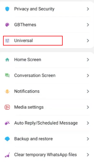
In most modified WhatsApp-style apps like JT WhatsApp, icon settings are placed inside the main settings menu.
To find it:
- Open JT WhatsApp
- Tap the menu button (usually the top-right corner)
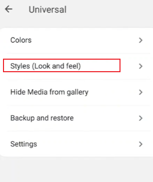
- Go to Settings or JT Settings
- Look for Appearance, Home Screen, or Launcher Settings
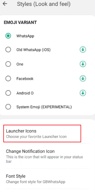
- Tap on App Icon or Icon Style
Different versions may place it in slightly different areas, but it is usually within appearance-related settings.
How to change the launcher icon step by step
Once you find the icon settings, the process is usually very direct.
Step 1: Open icon selection
Inside the icon menu, you will often see a list of available icons. These may include:
- Default WhatsApp-style icons
- Minimal icons
- Dark or transparent icons
- Custom icon packs
Step 2: Choose a simple design
If your goal is a discreet look, simple icons work best. These are usually:
- Plain green or dark versions
- Icons without text or logos
- Neutral shapes like circles or rounded squares
Step 3: Apply the change
After selecting your preferred icon:
- Tap Applyor Set Icon
- Wait a few seconds for the launcher to update
- Return to the home screen to check the result
In most cases, the change happens immediately without needing a restart.
Using external icon packs
Some JT WhatsApp versions support external icon packs, giving you more control over how the app looks on your home screen. You are no longer limited to the built-in options, but can apply more styles through the phone launcher or supported custom tools.
Here are the main points to understand:
- Extra design choices
External icon packs usually offer more variety than in-app icons. You can find flat styles, outline icons, monochrome sets, or fully minimal designs. - Better visual consistency
If you use the same icon pack across your phone, JT WhatsApp will blend in with other apps more naturally. This creates a smoother and cleaner home screen layout. - Applied through the launcher
In most cases, icon packs are not set inside the app itself. Instead, they are applied through your phone’s home screen launcher settings. - Theme matching option
Some icon packs are designed to match specific themes like dark mode, pastel colors, or transparent backgrounds. This makes it easier to build a unified style. - Easy switching between styles
You can change icon packs anytime without changing the app itself. This allows quick visual updates whenever you want a new look. - Lightweight customization
Icon packs only change appearance, not how the app works. This keeps the setup simple while still giving a fresh visual result.
Using an external icon pack is one of the easiest ways to reshape the overall look of JT WhatsApp while keeping everything on your home screen clean and consistent.
Matching the icon with your home screen style
After changing the launcher icon for JT WhatsApp, the next step is to ensure it blends seamlessly into your home screen. This step is often overlooked, but it has a crucial impact on the “simplicity” and balance of a phone. When you are using JT WhatsApp latest version 2026, this becomes even more important because newer updates often refine the interface, making visual consistency across apps feel more natural and polished.
A good home screen is not just about removing cluttered elements, but more importantly, about allowing all the small elements to coexist harmoniously, making everything look just right. The app icon is one of these key elements.
1. Keep a consistent color direction
Try to avoid using too many bright colors on the same screen. If the wallpaper is dark, bright icons will appear too glaring. If the wallpaper color is light, soft or dark icons are usually more suitable.
A simple way to decide:
- Dark wallpaper → dark or neutral icons
- Light wallpaper → soft green, gray, or minimal icons
- Gradient wallpaper → simple flat icons work best
When colors stay in the same “family,” the home screen feels more stable and easier on the eyes.
2. Align with your wallpaper, not against it
The wallpaper is the background of everything, so the icon should support it, not compete with it.
For example:
- If your wallpaper already has patterns or objects, choose a very simple icon
- If your wallpaper is plain, you can allow slightly more detail in the icon
- If your wallpaper has strong contrast, keep icons very minimal to avoid visual noise
This balance makes each element easier to notice without feeling crowded.
3. Match icon style with other apps
Your JT WhatsApp icon should not look like it belongs to a different phone. It should fit with your other apps.
Check these points:
- Are most of your apps rounded or square?
- Do they use flat design or slightly 3D effects?
- Are they colorful or mostly neutral?
Try to keep JT WhatsApp in the same style group. If everything else is flat and simple, a detailed icon will stand out in a distracting way.
4. Space and layout matter as much as design
Even a good icon can feel off if the layout is messy. Keep spacing consistent:
- Avoid placing too many icons in one row
- Leave some empty space if possible
- Group similar apps together
This gives your home screen a structured look, and the JT WhatsApp icon will naturally blend in instead of feeling isolated.
5. Think in terms of “visual flow”
A clean home screen usually guides your eye, for example, from the top left to the bottom right.
If your JT WhatsApp icon breaks this visual guidance due to its color or shape, it will look somewhat out of place. If its gaze direction and color scheme are consistent with other icons, it will blend into the system rather than become the visual focus.
Final thoughts
Changing the JT WhatsApp launcher icon may seem like a small customization, but it can significantly improve the phone’s visual appeal and user experience. Whether you prefer a clean, minimalist design or a dark theme, icons play a vital role in shaping the style of your home screen.
With just a few taps in the settings, you can adjust the icons to match your personal layout and maintain visual consistency.